Dec 2024 - Feb 2025
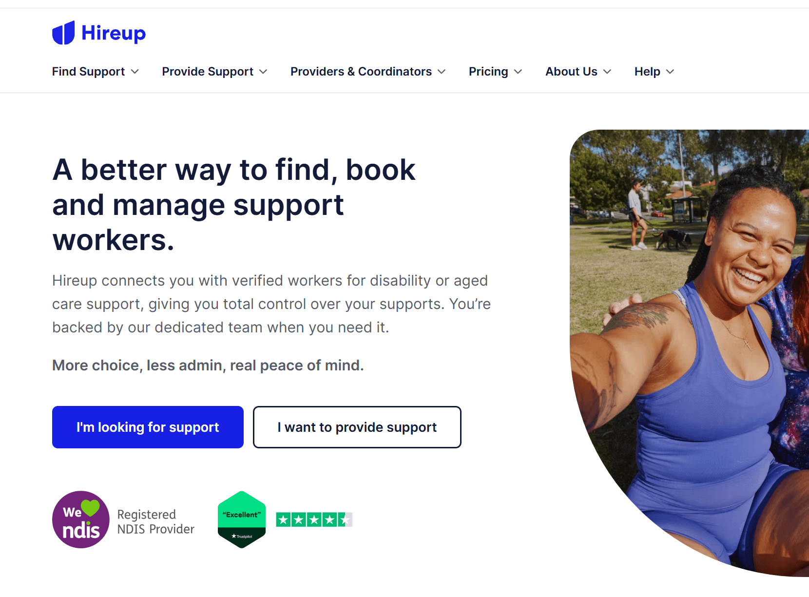
Designing an accessible onboarding experience for users with intellectual disabilities driving a 70% increase in member conversion
Re-designed MeplusMore's intellectual disability learning platform onboarding to help users (including NDIS government supported users) to sign up and start their learning journey towards independence.
B2C
B2B
Cognitive accessibility
Australian NDIS Government services
Service providers
How can people with intellectual disabilities start a journey of independence, if the very first steps are not accessible?
My design approach: Conducted heuristic analysis and benchmarked high-performing platforms to surface effective usability and accessibility patterns. Used insights to improve onboarding accessibility and iteratively tested with users to identify mental models & needs to optimise design.
Role
UX/UI designer
Timeline
2.5 months
Client
MeplusMore
Responsibilties
User research, heuristics analysis, user flow, rapid protoyping, usability testing
Deliverables
UX heuristic audit + MVP prototype with a scalable design system and developer handoff.
Business objective
Engage Individuals with intellectual disabilities and advocates to convert into members (B2C)
To engage disability service providers to incorporate MeplusMore into their offerings (B2B)
How I created value and impact
+
%
70
increase in member conversion
by tailoring CTA and navigation entry points for specific user needs
+
%
50
increase in ease of use rating
by using step-by-step flow with progress cues to guide users with cognitive disabilities to sign-up
Design solution overview


Before
After
Problem
Difficult to navigate landing due to complex icons and no clear entry point especially for government-supported NDIS disability users.
Solution
Tailored CTA and navigation entry points for specific user needs including NDIS support with simplified icons to reduce cognitive load.
Problem
Accessibility tools were hard to locate and use, especially for users with screen readers. Users also didn’t understand how Easy Read worked.
Solution
Designed accessibility toolbar to help users find and use tools, with voice-over navigation, full-screen search & easy-reading mode toggle.
Problem
Onboarding flow excludes 90% of users under are government funded (NDIS), forcing them to call for support without a clear path to sign-up.
Solution
New flow grants dashboard access before membership confirmation, making sign-up accessible to all and enabling freemium upsell.
Problem
Hidden entry point for providers and no evidence of results makes it hard for them trust and adopt MePlusMore offerings.
Solution
A clear provider entry point with seperate landing with reviews, and client logos to build trust and mirror their decision-making flow.
Full case study reading time: 8 minutes
The problem
70% of Meplusmore's current members have intellectual disabilities
and are unable to signup to the learning platform independently
Indicating the onboarding experience is not effectively designed to support user needs,
a clear barrier to Meplusmore’s sign-up conversion
Landing page
Signs up
Learning course
Meplusmore learning platform
Misaligned with the product mission, the onboarding doesn't empower users with intellectual disabilities to navigate their learning journey independently.
Understanding the users
A closer look at users needs with intellectual disabilities
Reveals onboarding architecture and navigation needs to support the range of cognitive accessibility needs in order for users to sign up.
ADHD
Needs clear
visual supports
Screen readers
Keyboard
Accessibility
Dyslexia
Large and
readable fonts
Autism
Step by step
instructions
Range of core user cognitive needs
Meplusmore has also expanded their offerings to B2B providers
and mapping all users and needs reveals how complex the architecture needs to be to support.
Individuals (B2C)
Accessibility for all
cognitive abilities
Advocates
Wants to help individuals
towards independence
Providers (B2B)
Needs group
membership packages
NDIS users
(government supported)
wants to pay using funding package
Support workers
Helps individuals work towards independence
Organisations
Looking for
workshops
Support
coordinators
Memberships
98% of current members
Map of users and their needs
Shaping the design objective
How can the onboarding be designed to meet business objectives while staying aligned with the product mission of empowering self-led learning?
Convert users (B2C) into members
Attract providers (B2B) to adopt offerings
Design goal: Accessibility for all mental models
See trade-offs
To align with MeplusMore’s product mission of everyone having access tools for independence, the experience needs to be accessible to all users and support a range of mental models.
Approach
I kicked off with a heuristic audit to identify usability gaps
and found 3 key problem insights
Given MeplusMore’s low UX maturity, I began with a heuristic audit of the onboarding journey including the user entry points of the landing page. Applying Nielsen’s 10 heuristics helped identify usability gaps and accessibility barriers early.
Landscape research
To solve, I analysed high-performing patterns from sites
that excelled in addressing similar usability problems


Rapid ideation & prototyping
Insights from landscape research guided concept sketching,
shaping landing navigation and onboarding flow
Using the Crazy 8s method, I rapidly ideated on key problem areas using insights gained form high performing usability patterns found in landscape research. The strongest sketches informed the site’s core navigation and onboarding flow.
Landing page


Tailored CTA entry points
to help users navigate to offering
Accessibility toolbar

Accessible tools to support range of cognitive needs
Onboarding step by steps


Step-by-step flow with progress cues guides sign-up
NDIS user onboarding

Tailored sign up entry point for government supported users
Userflow
Original individual onboarding flow only allows 2% of users can sign up
Original signup user flow
Login
Sign up
Free trial
Silver membership
Gold membership
Providers
Choose
learning course
Birthdate
Address
Password
Support contact
Payment
No option for 98% users on government supported NDIS packages
New flow grants dashboard access before membership confirmation, making sign-up accessible to all membership types and enabling freemium upsell
New signup user flow
Sign up
Name
Age
Support
contact
Welcome
to platform
Free trial
Online membership
Print & online
Ndis package
Learning
course
NDIS users get freemium access while NDIS government supported package is processed
Wireframes & User testing
Sketches and userflow shaped wireframes architecture, but user testing revealed the 2 key gaps in the choice architecture that disrupted how the core users made decisions, reducing engagement.

1.
Individuals +
Ndis users
2.
Providers
5 users ( 2 providers, 2 individuals, 1 advocate) participated in usability testing to evaluate architecture and assess whether users could navigate the offering, sign-up and engage with the service. Testing revealed two key gaps in the architecture that hindered engagement with core users.
#1 Problem: Ndis users don’t see a clear option or have no help/support, the choice architecture suggests the product isn’t for them, leading to disengagement
Landing page wireframe useability test

3 dislikes
2 likes
2 comments
5 shares
Individual - ADHD & Autism on NDIS goverment support
Advocate - Parent of Individual
Unexpected turning point in the design process
To find a solution, I revisited landscape research to identify existing landing page patterns that accommodate diverse user needs and entry points.
Solution: quick link bars help users with diverse needs quickly recognise relevant options and support, making it easier to engage.
Similar to patterns found in superannuation offerings, which also cater to diverse needs.

Quick link bar for diverse user needs and find help
Australian Super landing page
Trade-off: Entry points for diverse user needs > Simplicity for cognitive load
This design decision was made to ensure users could quickly recognise pathways relevant to them, encouraging deeper engagement and reducing friction especially for nidis users.

To support users with
reading difficulties
Entry point for NDIS
government supported users
Re-designed Meplusmore landing page with quick link bar
This design decision surfaced visibility of previously hidden offerings,
aligning the architecture with core user needs to engage sign-up.
Before site map

Problem: Hidden entry point for sign up, providers and government supported NDIS users (98% of current members)
After site map

Solution: Visible entry points for user needs and support/help, giving both core providers and NDIS users direct access to sign-up and relevant offerings.
Visual design decisions to support an easier cognitive load
Trade-off: Balance AAA contrast rating for intellectual disability entry points to maximize clarity and lower contrast button fill for providers to manage cognitive load.
Balances accessibility by highlighting entry points for users need the cognitive support.


Individuals: High contrast for better
visibility for entry points


Providers: lower contrast for entry
points to balance landing cognitive load

New Meplusmore landing page
48px

16px


Large buttons & keyboard indicators: easier to identify, reduce motor effort, and support screen reader accessibility. WCAG 2.1, 2.4.7, 2.5.5

160px
Grid: 8px (12 column) + 160px wide margin
White space: wide margin space, makes content
easier to scan reducing cognitive load. WCAG 2.2

Hand drawn elements:
to add human touch with a approachable feel.

Filled icons: improve recognition when filled. WCAG 2.1

Large type scale : using Nunitō’s distinct counters enhances readability cognitive aaccessibility. WCAG 2.1

Mission-led illustrations: Capture the mission to connect learners on the same journey anytime, anywhere.
Design system
#2 Problem: The offering is shown in an order that doesn’t match the way providers typically evaluate their options, which disrupt their decision-making flow.
Providers landing wireframe useability test

